
The forest plot is a powerful graphical representation that summarizes the strengths of a statistical association between variables (e.g predictors, treatment arms, etc..) and clinical outcomes, across multiple subgroups, within a common scientific question.
We will present here a simple method to generate the forest plot using SAS® GTL feature, which is one of the most flexible ways to produce these highly customizable figures.
For our example, we have selected a bone marrow cancer study for which the data is available publicly online. You can find the data in the full SAS code page. In this study, we sought to visually demonstrate the effectiveness of the treatment (Methotrexate) compared to placebo, within various subgroup populations.
Here is the forest plot that we aim to create in this project (figure 1):
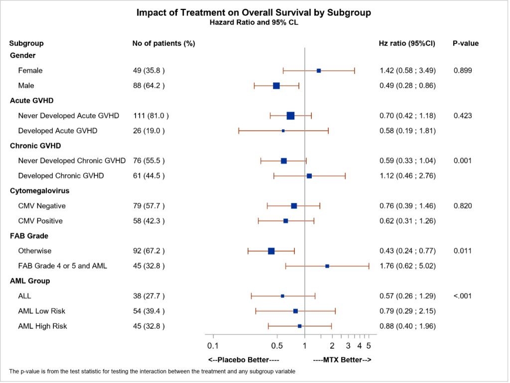
Figure 1 : Forest plot showing the statistical comparisons of clinical efficacy between Methotrexate and Placebo, across various patients’ subgroups.
Don’t worry, it’s easier than it looks! Just follow the few steps..
The procedure described below takes reference from a previous work (Matange 2014,2016; Hebbar 2015)
The very first step of the generation of a forest plot is the creation of an Input dataset including all the information needed to present the data and the graphical elements on the final plot.
In the figure 1, the main reported information are:
Here is how the Input dataset used to generate this plot looks like.
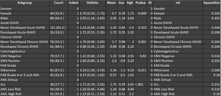
Figure 2 : Input dataset supporting the creation of the forest plot
There are 11 variables that are reported into the Input dataset. We will describe some of them.
The objective of this step is to add some additional supportive variables in the Input dataset to enhance the structure of the plot, namely INDENT, ID, REF and SQAURESIZE.
By using PROC TEMPLATE, we create a template, here by using the Graph Template Language (GTL) to layout the five columns of the figure.
Graphic Template Language (GTL) is a part of the Output Destination Style (ODS) Graphics software. GTL provides the user more control and flexibility over other graphical procedures. By using GTL, the user has the flexibility to modify features for graphs that are based on procedure-driven templates, as well as create completely customized graphs that may not be feasible to produce from a procedure-driven template.
Furthermore, GTL makes it simpler to integrate characteristic which in the past may have been difficult to include. For example, inserting a table of data within the output area or representing multiple graphs. It can also add multiple graphs of the different or same graph types (scatter plot, step plot, box plot etc) in the same plot.
We will go through the GTL section of code and try to highlight important parts of each section and their purpose.
First step to provide the name to the template in DEFINE STATGRAPH. We defined few dynamic variables for controlling the row band (line) colour and thickness. We call them at each section of the graph in REFERENCELINE statement.
This SAS® code set the basic structure of our graph. We have used LAYOUT=LATTICE with 5 columns (related to the 5 elements in the final representation presented in figure 1).
Additionally, COLUMNWEIGHTS signifies the weight or width of each column. It should be add up to 1.
This SAS® code defines the header section of the graph. The SIDEBAR statement here, defines the header space of the graph, we have used 2 rows and 5 columns to show labels for all column values.
ENTRY statement contains all the header labels which represents each column. First row has been kept as blank and the labels have been defined at second row.
This SAS® code creates the first column, i.e., “Subgroup” in this case. We can define the X and Y axis by using XAXISOPTS or YAXISOPTS statements in GTL. REFRENCELINE gives the flexibility to use the dynamic variable (mentioned above in first section) to enhance the features of the horizontal line or a row.
The newly introduced statement AXISTABLE, which enables the user to write simple and short code within only one overlay layout. AXISTABLE statement has been used to present the information inside the overlay layout’s inner margin.
Second section created the column which represents the number and percentage of patents in each subgroup.
Third section created the hazard ratio graph and column for estimates and 95% Cl. The graphical part has been shown by using variable mean, high and low in SCATTERPLOT. For purpose of representation, we have chosen here log axis by using LOGOPTS option however LINEAROPTS can also be used here. SCATTERPLOT statement is for the risk difference plot with bars for representing the confidence intervals. SIZERESPONSE option has been used to signifies the population of the group.
The hazard ratio and 95 % confidence limits has been shown in the fourth column by using the HzRatio variable.
The last section represents the column for P-value and footnote as EHTRYFOOTNOTE statement. ENDLAYOUT and ENDGRAPH has been used to close the graph template
We have modified the default HTMLBlue style to enhance the visualization and to more easily control the fonts shown in the graph.
Once the Input dataset and the figure template are both set, we can finally create the Forest plot by using ODS procedure SGRENDER. For better visualization we have used a modified style (ListingFP) to include in the ODS LISTING statement.
We call this template in the SGRENDER procedure along with some dynamic variables which has been used in the GTL for color and for font weight. In the above plot we have kept both header and body rows as white. User may also select different colours as well.
We can also specify the format of the file and quality of graph by controlling the IMAGEFMT and IMAGE_DPI respectively. We can also include SGANNO option and add various annotation in the graph, however that we will discuss in a separate topic as its quite a vast topic.
The purpose of this topic was to simplify the GTL procedure so that it not only helps those who already know how to create graphs using traditional or SG procedures but also those who are entirely new to graph programming. Forest plots may be created with other methods as well. However using GTL gives the user of much needed flexibility.
Sign up here to enjoy new blog articles about biostatistics, clinical data analytics, and stat programming